


Microsoft has redesigned its Bing search results page by removing the unnecessary cluttered items from the page. This fresh simpler look is an effort to help users scan results more easily and navigate more smoothly than before.
The “Bing Team” wrote in a blog post, “Over the past few months, we’ve run dozens of experiments to determine how you read our pages to deliver the link you’re looking for. Based on that feedback, we’ve tuned the site to make the entire page easier to scan, removing unnecessary distractions, and making the overall experience more predictable and useful. This refreshed design helps you do more with search-and gives us a canvas for bringing future innovation to you.”
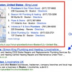
Here’s a look at old Bing for a ‘search market share’ query:

The old user interface had related searches and search history options in the left sidebar. There was also a gray colored bar at the top of the page. The spacing between the results and links was minimal.
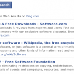
Here’s what the new Bing looks like:

The major difference is that all the information that previously appeared in the left sidebar has been eliminated from there. Related searches appear on the right sidebar below the sponsored ads.
The gray bar at the top of the page has disappeared. The menus like Web, Images, Videos, Maps and News appear at the top. Social network results, local information and search history can be found under the sub menus of the main menu items.
Though the home page of Bing has not yet been altered now, Bing says that it is testing some new ideas which we can expect to see in the near future.
Bing hopes the new changes will help people “spend less time searching and more time doing.”


Leave a Reply